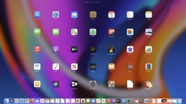
If you own an iPhone or iPad, then you have probably noticed how uniformity in app icons benefits the appearance. Everything is enclosed in strict squares with rounded corners, and because of this, the operating system looks almost perfect. On macOS, developers are not as tightly constrained, so some create free-form icons, which sometimes spoils the perception of the system and is an eyesore. Recently, of course, there has been a trend towards uniformity, but some strange icons are still found.
Fortunately, on macOS you can fix this without any difficulties by simply changing the application icon to the one that you like. Before that, you will have to search for the icon itself or draw it yourself, but there will be no problems with replacing it. Here’s how to change app icons on a Mac .
Change Icons in Mac OS
First of all, it is worth noting that the method that we will use will change the icon of the selected application everywhere: in the Finder, Dock, Launchpad and any other place where it is used. You can replace not only the program icon, but also a folder or file. If you constantly use some folder or document, then by installing some catchy icon, you can easily find it in any mess of desktop or Finder icons. Therefore, the replacement of icons has not only an aesthetic side, but also a practical benefit. To add a new application icon, do the following:
- Find your favorite JPG or PNG icon online. I used the icons8 site and downloaded it from there. You can draw your own image in any graphics editor. The main thing is to use the above formats.
- Open Finder and navigate to the Applications folder.
- Find the program you are interested in and right-click on it.
- Click Properties. A small window will display all the information about the selected application.
- Using the Preview program, open the icon you created or downloaded earlier.
- On the status bar, select “Edit” and click “Select”.
- Copy the selection with cmd+C.
- Return to the application data window, click on the icon in the upper right corner and press cmd + V.
- In some situations, you may then be required to enter a password for the account.
Now the new icon will be successfully applied to the application, and you will be able to observe it in all parts of the operating system. You can change the icon and a little easier:
- Follow all the steps from the previous instructions before switching to the Preview application.
- Search the Finder for the saved image of the created or uploaded icon.
- Drag it to the detailed information box on top of the old icon so that a “+” in a green circle appears next to the cursor.
- If necessary, confirm this action with a password.
If the application is already in the Dock, then its icon there may remain unchanged. You can fix this misunderstanding like this:
- Open Terminal.
- Enter the command:
- and press the Enter key.
The command will allow you to update the Dock , and with it, it will change the icon of the application you need. The procedure is very simple, so you can not be afraid that something will go wrong.
How to disable SIP on Mac OS
However, the steps above will not work for standard app icons on the following versions of macOS:
- OS X El Capitan.
- macOS Sierra.
- macOS High Sierra.
- macOS Mojave.
- macOS Catalina.
- macOS Big Sur.
- macOS Monterey.
- macOS Venture.
This is due to the fact that they are equipped with special protection System Integrity Protection. However, it is very easy to turn it off, replace the icons of interest, and then return everything back. It is done like this:
- Turn off your computer.
- Start your Mac in Safe Mode : On an Apple Mac, by holding down the Power button; on an Intel Mac , by using the cmd+R keyboard shortcut.
- On the status bar, select “Utilities” and launch “Terminal”.
- Enter the command:
- If “System Integrity Protection status: enabled” is displayed, enter the command:
- Press Enter, enter a password if required, and restart your computer for normal login.
After that, you can change the icon of any standard application. Once you have completed all the steps, be sure to turn System Integrity Protection back on. This is also done from recovery mode using the command:
Be sure to restore this setting, as the security of your computer and the data stored on it directly depends on it.
How to restore the app icon
Returning the icon to the standard one, by the way, is also very simple. Naturally, for embedded applications, you will have to disable System Integrity Protection first . Removing a custom icon goes like this:
- Open Finder and find the app or folder you changed the icon for.
- Right click and click Properties.
- In the window that appears, click once on the application icon and press Delete or the delete arrow on your keyboard.
- Enter your account password if necessary.
All! So simply and easily previous actions can be rolled back. Don’t forget to enable System Integrity Protection if you are doing this for standard applications.

